Contents
- Why this topic matters
- What green and red kernels mean in commercial terms
- Why color matters to industrial buyers
- When green kernels make more sense
- When red kernels make more sense
- Why color alone is not enough
- Application guidance by buyer segment
- How color affects pricing logic
- Technical considerations beyond appearance
- Questions industrial buyers should ask suppliers
- Common mistakes to avoid
- How Atlas uses this knowledge
- Frequently asked questions
Why this topic matters
Kernel color matters because industrial pistachio buying is rarely a simple commodity decision. Buyers do not purchase kernels only by weight. They purchase them for a purpose. That purpose may be premium pastry decoration, confectionery fillings, gelato inclusion, pistachio paste, powder production, bakery blending or a retail ingredient line. Each of those applications places a different value on visible color.
In premium visible uses, a greener kernel may support stronger visual impact and stronger premium perception. In less visible or more blended uses, the commercial advantage of greener material may be smaller, while the cost difference can remain meaningful. That is why industrial buyers should avoid asking only, “Which one is better?” and instead ask, “Which one is better for our application?”
This distinction is important because many buyers unintentionally over-specify. They purchase greener material than they actually need, which increases cost without producing a corresponding market benefit. Others under-specify and later discover that their finished product does not look as premium as they intended. Better understanding reduces both errors.
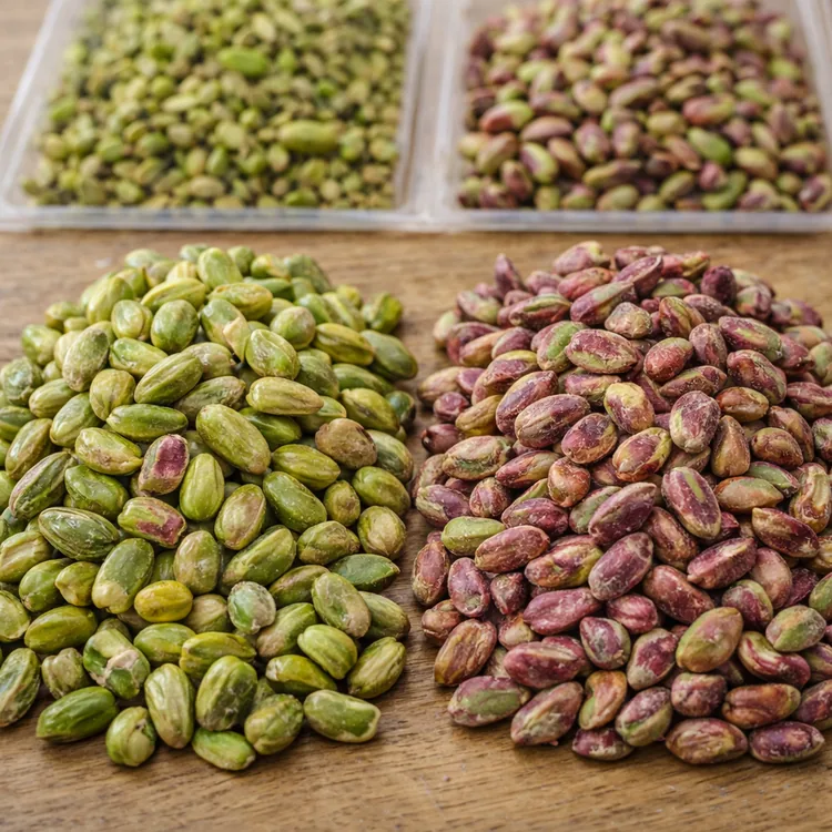
What green and red kernels mean in commercial terms
In commercial trade, the terms green kernels and red kernels generally refer to visible kernel appearance rather than a completely separate product category. Buyers use these terms as shorthand for color families that carry different commercial expectations.
Green kernels are typically associated with brighter, more visibly green material that may be preferred in premium, exposed or color-sensitive applications. Red kernels generally refer to material with a redder, darker, warmer or less vividly green appearance. That does not automatically make them inferior. It simply means their best-fit application may differ.
For industrial buyers, the key point is that color is part of product definition. It is not only a cosmetic trait. It may influence whether the product is sold as premium, whether it supports a visually green finished item, and whether the buyer can justify paying for a more selective grade.
Why color matters to industrial buyers
Finished product appearance
In many industrial applications, the kernel remains visible in the final product. This is common in pastry toppings, confectionery centers, premium chocolates, ice cream ripple systems, bakery inclusions, sliced dessert finishes and decorative fillings. When the customer can see the pistachio, the visual quality of the kernel becomes commercially important.
Premium positioning
Kernel color can influence how premium a finished product appears. A greener kernel may help a product communicate higher perceived value, especially in categories where pistachio is associated with luxury, artisanal quality or ingredient-led positioning. For brands selling indulgence, natural richness or premium craftsmanship, color becomes part of the product story.
Customer expectation
Some markets strongly associate pistachio quality with visible greenness. In such markets, color affects not only internal buying logic but also downstream customer expectation. If buyers serve customers who expect a vivid pistachio presentation, greener kernels may be commercially justified even if the cost is higher.
Specification accuracy
Color matters because it helps define the specification more clearly. A supplier quote that only says “pistachio kernel” may not be detailed enough for a buyer whose product outcome depends on visual appearance. Clarifying whether a greener or redder kernel profile is acceptable can reduce misunderstandings before an order is placed.
When green kernels make more sense
Greener kernels are often more valuable in applications where the pistachio remains visible and where the visual impression materially affects the finished product's appeal or pricing power.
Premium pastry and patisserie
In premium pastry, pistachio is often not just an ingredient but a visual signature. Entremets, tartlets, petits gâteaux, layered desserts and decorative pastry items may all benefit from kernels that read clearly as green. In these cases, the kernel contributes directly to the perceived refinement of the finished product.
Luxury confectionery
Chocolate tablets, pralines, filled bars and artisanal confectionery often rely on exposed pistachio color to signal ingredient richness. Greener kernels may support stronger shelf appeal, a clearer premium message and a more distinctive cross-section when the product is cut or broken.
Gelato and ice cream inclusion systems
In premium frozen desserts, visible color can matter significantly. Toppings, inclusions and finishing layers often benefit from kernels that help reinforce the pistachio identity visually, especially when the brand wants the consumer to recognize real pistachio content immediately.
Decorative topping and garnish use
If the product is used for final decoration, visible coating or presentation finishing, greener kernels are often easier to justify. Here the color is not secondary. It is one of the main reasons the ingredient was selected.
Products marketed around pistachio identity
When the finished item is sold explicitly as a premium pistachio product, and the pistachio is expected to be part of the product's visual promise, greener kernels may help support a more coherent commercial outcome.
When red kernels make more sense
Red kernels can be a rational and commercially strong choice in many industrial uses. They should not be viewed as automatically lower-value material in every context. Their suitability depends on how much visible green color actually matters after processing.
Paste and blended ingredient applications
If kernels will be further processed into paste, fillings, creams or blended systems, the final visible kernel color may become less important than consistency, functionality and cost control. In these cases, red kernels may provide a better commercial balance.
Bakery and internal-use applications
In cakes, bakery bases, fillings and dough systems where the kernel is ground, chopped finely or integrated into a broader formula, intense greenness may not always create a proportional benefit. A buyer may achieve the desired flavor and pistachio identity without paying for the most visually premium color profile.
Industrial scale manufacturing
High-volume manufacturers often need to balance sensory goals with cost architecture. If their finished product does not depend heavily on visible green presentation, red kernels may be commercially more efficient while still delivering strong application performance.
Mixed-format or coated products
In products where pistachio is combined with other ingredients, coatings, fillings or visual elements, the commercial importance of greener material may decline. The right question becomes whether the consumer will still perceive the color difference in a meaningful way.
Applications driven more by function than display
Many industrial products are purchased for texture, nut identity, grind suitability or recipe integration rather than for premium visual display. In those cases, a buyer may choose red kernels not because quality does not matter, but because visual color is not the main value driver.
Why color alone is not enough
Kernel color is important, but it should never be used as the only buying criterion. Industrial buyers also need to consider how the material behaves in production, how consistent the lot is, how cleanly it is prepared, how it will be packed, and whether the grade makes commercial sense for the final application.
Consistency matters
A lot with inconsistent appearance may create issues even if some kernels are attractively green. Industrial buyers often value repeatability more than isolated visual highlights.
Application fit matters
The most important question is still whether the color level matches the use case. A visually premium grade may be underutilized in one application and completely justified in another.
Processing outcome matters
The final effect of color depends on whether the kernels are used whole, chopped, sliced, ground or blended. Buyers should think through how visible the color will remain after processing.
Commercial efficiency matters
Paying more only makes sense when the finished product captures that value. The best industrial buying decisions align ingredient cost with visible market benefit.
Application guidance by buyer segment
For pastry manufacturers
- Prioritize greener kernels for visible toppings, side coatings, garnish and exposed inclusions.
- Review whether internal fillings and blended components truly require the same color level.
- Consider using different grades for visible use and internal use to optimize cost.
For confectionery producers
- Use greener kernels where cross-section appearance or decorative finish supports premium positioning.
- Assess whether red kernels are sufficient for centers, blended fillings or covered applications.
- Think about how the consumer will actually encounter the pistachio visually.
For ice cream and gelato brands
- Greener kernels may help where inclusions remain visible or where the product is marketed as visibly pistachio-rich.
- Red kernels may still work in internal systems where texture and nut identity matter more than color display.
- The right choice depends on whether the brand sells pistachio visually, sensorially or both.
For paste and powder producers
- Evaluate whether visible kernel tone meaningfully affects the finished output.
- Prioritize consistency and processing suitability alongside color expectations.
- Do not assume the visually most premium kernel is always the most commercially sensible raw material.
For distributors and traders
- Segment customers by end use instead of selling one color profile as universally ideal.
- Build pricing logic around application fit rather than generic “better or worse” language.
- Help customers understand when greener material creates real value and when it may simply raise cost.
How color affects pricing logic
Color often affects price because greener kernels are typically associated with stronger visible appeal and narrower selection logic. Buyers may therefore see price separation between greener material and redder material. But the more important question is not whether greener kernels cost more. It is whether that extra cost produces a meaningful return in the final product.
Greenness can carry premium value
In premium visible applications, greener kernels may justify their price because they help support stronger product presentation, better shelf impact and higher perceived ingredient quality.
Not all buyers need to pay for maximum color
For many industrial uses, especially where the product is blended, processed or hidden, the commercial return on greener material may be limited. In these cases, paying more for maximum greenness can weaken margin without materially improving the finished product.
Value should be judged after processing, not before
Buyers should think through how the ingredient will appear after cutting, grinding, mixing or incorporation. The relevant value is the value visible in the finished product, not only in the raw kernel tray.
Technical considerations beyond appearance
Particle outcome after cutting or grinding
If the kernels will be transformed into cuts, granules, powder or paste, the final visible effect may be different from the raw whole-kernel appearance. Buyers should assess color in the form in which it will actually be used.
Lot consistency and sorting quality
Industrial users often need predictable performance from batch to batch. A more consistently sorted lot may be more valuable than a nominally greener lot with broader visual variation.
Visual uniformity in finished applications
Uniformity is often as important as intensity. A slightly less vivid but consistent color profile can be commercially preferable to a mixed visual result that looks less controlled.
Packaging and handling
Product quality must remain commercially usable after packing, storage and transport. Industrial buyers should connect visual goals to the real handling journey of the product.
Fit with the target formulation
Some applications are highly sensitive to visible color, while others are driven more by integration, texture or base flavor. Technical fit should therefore be judged in relation to the final recipe system.
Simple comparison: green kernels vs. red kernels for industrial use
| Dimension | Green kernels | Red kernels |
|---|---|---|
| Primary value driver | Visual premium appeal | Broader industrial practicality |
| Best suited for | Visible, premium, color-sensitive applications | Blended, internal, broader-use applications |
| Commercial positioning | Higher-end, appearance-led | Function-led, cost-rational, versatile |
| Typical buyer concern | Presentation and premium impact | Application fit and economic efficiency |
| Common mistake | Overpaying where color is not fully used | Underestimating visible quality requirements |
How industrial buyers should make the decision
The best decision usually comes from working backward from the finished product. Buyers should ask:
- Will the customer clearly see the pistachio?
- Does greener color materially improve the final product's market appeal?
- Will the product be chopped, ground or blended before use?
- Are we purchasing for premium positioning, general production or both?
- Would two different kernel grades create a better cost-performance balance across our product line?
When those questions are answered honestly, the decision between green and red kernels becomes much clearer.
Questions industrial buyers should ask suppliers
Commercial questions
- Which customer segments usually buy this kernel color profile?
- Is this grade commonly used for visible applications or for further processing?
- Would you recommend this material for premium finished products or broader industrial use?
- How should we think about the cost difference relative to our intended application?
Technical questions
- How consistent is the color profile from lot to lot?
- Is this material better suited to whole-kernel use, chopped use, powder or paste processing?
- How is the lot sorted and prepared before packing?
- Should we evaluate this kernel as a raw whole product or in its processed end-use form?
Strategic questions
- Are we over-specifying for our current product mix?
- Would a greener grade improve our market position enough to justify the cost?
- Should we buy multiple grades for multiple applications instead of one universal kernel type?
Common mistakes to avoid
-
Assuming greener always means better.
Greener kernels may be better for some applications, but not automatically for all industrial uses. -
Judging raw color without thinking about the finished product.
The important question is how the color performs after chopping, grinding, blending or decorating. -
Using one kernel grade for every application.
Many industrial buyers can improve economics by matching different grades to different product roles. -
Comparing price without comparing use case.
The right comparison is not cheaper versus more expensive. It is fit-for-purpose versus not fit-for-purpose. -
Ignoring customer perception.
In appearance-sensitive markets, visible kernel color can matter more than buyers initially expect.
How Atlas uses this knowledge
Atlas uses academy content to help buyers think in commercial and technical terms at the same time. In discussions about green versus red kernels, the goal is not to push one option universally. The goal is to help buyers connect kernel color to real application logic.
This matters because better sourcing decisions usually come from better questions. Instead of asking only for price or availability, buyers should define where the pistachio will appear, how visible it will remain, what their customers expect, and whether they are purchasing for premium display, internal use or a combination of both.
- We connect kernel color discussions to real end-use categories.
- We connect commercial priorities to ingredient specification logic.
- We help buyers compare greener and redder material more intelligently.
- We support clearer conversations around kernels, cuts, powder and paste-oriented supply.
- We aim to reduce ambiguity before purchasing decisions are made.
Final takeaway
Green kernels and red kernels should not be treated as a simple quality hierarchy. They should be treated as different commercial tools with different best-fit uses. Greener kernels may create strong value in visible premium applications, while red kernels may be the smarter choice for broader industrial processing where color intensity is less critical.
For industrial buyers, the most effective decision comes from aligning color with application. When buyers connect kernel appearance to the actual finished product, they make stronger sourcing decisions, protect margin more effectively and communicate product value more clearly to their own customers.
That is why better pistachio buying starts with better product understanding. Once the conversation shifts from “Which one is better?” to “Which one is right for our use?” the sourcing process becomes much more precise.
Frequently asked questions
Who is this article for?
This article is intended for B2B buyers, importers, distributors, brand owners and food manufacturers researching Turkish pistachio kernel supply.
What is the difference between green and red pistachio kernels?
In commercial trade, the distinction usually refers to visible kernel color and appearance. Green kernels are often associated with premium visual applications, while red kernels may be well suited to broader industrial use depending on the finished product.
Are green kernels always better?
No. The better choice depends on the application. If the final product benefits strongly from visible greenness, green kernels may be justified. If not, red kernels may offer a more practical commercial balance.
When should industrial buyers prioritize green kernels?
Buyers should often prioritize greener kernels when the pistachio remains visible in premium pastry, confectionery, topping, garnish or other appearance-led applications.
When are red kernels a sensible choice?
Red kernels can be a sensible choice for paste, powder, blended fillings, bakery systems and other applications where intense visible green color is not the main driver of finished-product value.
Does color affect price?
It often can, because greener material may be associated with more selective premium applications. Buyers should judge that price difference against the value it creates in the final product.
Can Atlas help buyers choose the right kernel profile?
Yes. Atlas helps buyers connect kernel color, application, product form and commercial goals so sourcing discussions become more practical and more accurate.
Looking for Turkish pistachio kernels for pastry, confectionery, ingredient manufacturing or distribution? Contact Atlas to discuss product form, kernel color expectations, packaging and supply requirements.