Introduction: why kernel color matters in commercial pistachio buying
In B2B pistachio trade, buyers rarely purchase on color alone, but they often judge a product by color before they judge it by anything else. Kernel appearance creates an immediate impression. It can suggest selectivity, freshness perception, application fit and overall grade positioning even before the product is tested in a recipe or compared against a formal commercial brief.
That is why kernel color matters. It acts as a fast visual signal inside a much broader quality conversation. In visible product categories such as pastry decoration, premium confectionery, dessert toppings, retail baking ingredients and certain gourmet snack or culinary uses, color can strongly influence how attractive the final pistachio product appears. In other categories, color may still matter, but less as a headline value driver and more as one part of a broader technical profile.
For buyers interested in Turkish Antep pistachios, kernel color should therefore be understood as a commercial indicator rather than as an isolated quality myth. It can support better decision-making, but only when interpreted alongside product format, intended use, pricing logic, consistency expectations and processing needs.
What kernel color indicates in practical trade terms
Kernel color can signal several things at once. It may suggest how visually selective the product is, how suitable it may be for exposed applications, whether it aligns with a premium market segment and whether additional sorting or tighter allocation may have influenced its value. In some formats, stronger color can contribute directly to perceived product quality. In other formats, it may be commercially interesting but operationally secondary.
Importantly, color does not function like a universal pass-or-fail test. A greener pistachio kernel is not automatically the right choice for every customer, and a less visually intense kernel is not automatically the wrong choice. What matters is whether the color profile matches the intended commercial use. Buyers who understand that principle tend to compare offers more intelligently and avoid paying for traits that do not add real value in their own business model.
Why visible quality cues carry weight in the pistachio category
Pistachios are a visually expressive ingredient. Unlike some raw materials that disappear completely into a formulation, pistachios often remain visible in the final product. They may be used as whole kernels, chopped inclusions, sliced garnish, dessert topping, confectionery center, bakery decoration or premium retail ingredient. Because of this, visual cues matter more than they do in many other food ingredient categories.
When a customer sees pistachio color in a finished application, they often interpret it as a sign of quality, indulgence and refinement. That is especially true in premium dessert and pastry environments. For this reason, buyers serving visible food categories often pay close attention to kernel tone and appearance during sourcing discussions.
However, the correct lesson is not simply that color is important. It is that color becomes commercially important when visibility and presentation matter to the final product.
Color as a market signal rather than a standalone quality claim
It is helpful to think of kernel color as a market signal. It communicates something about how the product may be positioned, but it does not tell the whole story on its own. A more visually appealing kernel may support stronger perception in a premium application, but it still needs to be assessed in relation to cut size, purity, consistency, processing form, packaging and overall suitability.
This is especially relevant in B2B sourcing because buyers are rarely purchasing a kernel for display alone. They are purchasing it for a commercial use. A pastry manufacturer may need color that supports decoration and premium presentation. A producer of pistachio filling may care more about processing suitability and flavor behavior. A powdered application may reduce the importance of visual whole-kernel appearance. In each case, color should be evaluated as part of the end-use logic.
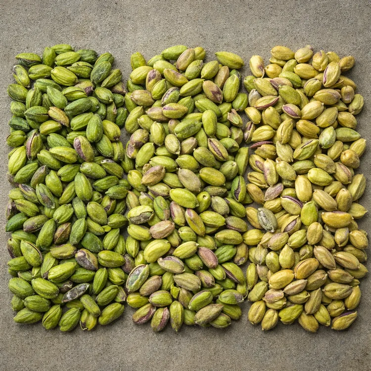
Why greener color often attracts commercial interest
In many pistachio markets, greener kernel tones are associated with higher visual appeal and stronger premium positioning. This is particularly common in categories where consumers or professional buyers can clearly see the pistachio in the finished product. In pastry, desserts, confectionery and decorative bakery applications, a visually strong pistachio can help the finished item look more attractive, more luxurious and more intentionally selected.
Because of that, greener or more visually refined kernels can carry greater commercial interest. They may be more sought after for specific applications and may support stronger pricing in those segments. This does not mean green is universally superior in every context. It means the market often rewards stronger visible appearance when appearance contributes directly to final product value.
Why color needs to be linked to application
The commercial meaning of color changes from one application to another. In a garnish or topping role, kernel color may be one of the most important buying points because the pistachio remains clearly visible. In a paste or blended filling application, color may still matter, but often in a more functional or moderate way. In some industrial contexts, the visual tone of whole kernels may matter far less than grind performance, consistency or supply practicality.
That is why smart buyers begin with the application and then decide how much color selectivity is worth paying for. A customer serving premium dessert counters may need a more visually selective kernel. A large food manufacturer using the product deeper inside a formulation may not need the same level of color intensity. The right buying decision depends on where value is created later in the chain.
Which applications usually care most about kernel color?
Color usually receives greater attention in categories where the pistachio remains visible to the end customer or where appearance helps define premium positioning. These often include:
- Pastry decoration: where kernel tone affects the visual elegance of the finished item.
- Confectionery and praline applications: where exposed inclusions or decorative elements contribute to luxury appeal.
- Dessert toppings and garnish: where pistachios function as both flavor and visual identity.
- Premium bakery: where visible toppings or fillings help support artisanal positioning.
- Retail ingredient packs: where the consumer judges the product visually through the pack or at the moment of use.
- Specialty gourmet formats: where appearance and premium cues influence price acceptance.
These are the kinds of categories in which color can become a stronger commercial differentiator.
Where color may matter less
There are also applications where color is still relevant, but less central. These may include formats in which the pistachio is ground, blended, coated, mixed into other ingredients or used in industrial manufacturing systems where the finished visual result is driven by several variables at once. In such cases, a buyer may still care about color profile, but not enough to justify paying for the most selective visual grade available.
Understanding this distinction helps buyers avoid over-specification. A more visually selective and more expensive kernel is not automatically better value if the final application does not reward that difference in a commercially meaningful way.
Kernel color and product grading
Color is often tied to how buyers interpret grade, even when grade itself includes several other factors. A visually stronger kernel may be associated with a more selective commercial profile, especially in applications where appearance matters heavily. At the same time, grade should not be reduced to color alone. Product grading can also involve cleanliness, uniformity, kernel integrity, cut profile, purity and application relevance.
This is an important point because buyers sometimes treat color as a shortcut for total quality. In reality, color may help indicate a certain level of selectivity, but it should still be reviewed alongside the rest of the product’s commercial and technical characteristics. A kernel with attractive tone but poor consistency or unsuitable format may still be the wrong choice for the application.
How color influences price perception
Kernel color can influence price perception quickly because it is easy to see and easy to discuss. Buyers often understand visually refined material as more premium, which can make a higher price feel more intuitive in the right market segment. In premium pastry, confectionery and gourmet retail channels, that perception can be commercially justified because better appearance may contribute directly to the finished product’s value.
However, price perception should not become price assumption. A buyer should still ask whether the application genuinely benefits from paying for a more visually selective kernel profile. If it does, the higher price may be commercially rational. If it does not, the buyer may be paying for a feature that adds little downstream value.
Why the same color profile can have different value for different buyers
Not all buyers measure value the same way. A specialty patisserie may view greener kernels as a direct contributor to visual brand identity. A confectionery exporter may value the same trait for seasonal premium products. A bulk manufacturer may see it as an attractive feature but not a major cost driver. This is why the commercial value of color is always relative to the business model behind it.
In other words, color is not just a product attribute. It is a value attribute shaped by customer type, end use, market positioning and pricing strategy.
Color and processing format
The importance of kernel color can also change depending on how far the product has been processed. Whole kernels, split kernels, slices, granules, powder and paste each present color differently in commercial use. In whole or visible cut formats, kernel tone remains more directly relevant because the eye still reads the pistachio as a distinct visual element. In more transformed formats, color can remain important, but the commercial logic may shift toward how the product performs in the final recipe or application.
This is why buyers should always discuss color in connection with format. A pistachio intended for visible garnish is not the same buying decision as a pistachio intended for paste production or deep inclusion inside a processed dessert system.
Whole kernels, cuts and slices: where color is easiest to evaluate
Whole kernels and visible cuts are often the formats in which color is easiest to assess and most commercially obvious. Buyers can quickly compare visual intensity, tone consistency and overall attractiveness. In sliced or decorative applications, even slight differences in appearance may become meaningful because the product is used to create a visible premium finish.
That is why color-sensitive buying conversations often begin with these formats. They make the visual impact of the pistachio more obvious and therefore make commercial differentiation easier to understand.
Powder and paste: when color becomes more application-specific
In powder and paste formats, color still matters, but the discussion often becomes more application-specific. The buyer may care less about the appearance of an individual kernel and more about the overall tone, consistency and functional suitability of the processed result in the final product. A bakery, dessert or confectionery manufacturer may therefore assess color through the lens of recipe performance rather than raw visual beauty alone.
This is a good example of why color should not be treated as a universal ranking system. It must be interpreted through the actual product form being purchased.
Why consistency matters as much as absolute color
For many commercial buyers, consistency is just as important as intensity. A buyer may not need the most visually selective color profile in the market, but they often do need repeatability. A stable and commercially suitable color profile across repeat orders can be more valuable than an exceptionally attractive one-off sample that cannot be matched later.
This matters especially in branded products, recurring dessert lines, premium bakery programs and private-label retail packs. Inconsistent color can weaken finished product appearance, complicate production expectations and reduce trust in repeat supply. That is why buyers should assess not only how the sample looks today, but how realistically the supplier can maintain a similar profile across future shipments.
Color should be interpreted together with other quality cues
Kernel color is useful, but it should always be read with other commercial signals such as cut size, particle uniformity, kernel integrity, general cleanliness, packaging logic, moisture management and application fit. A visually strong kernel that arrives in an unsuitable format or performs poorly in the target application is not a good purchase. A slightly less visually intense kernel that is more consistent, better suited to the recipe and more aligned with the customer’s price structure may be the better commercial choice.
Good pistachio buying decisions come from combining visual assessment with functional thinking.
What buyers should look for when reviewing samples
When reviewing pistachio samples in color-sensitive categories, buyers should avoid reducing the decision to a simple “greener is better” reaction. A more useful sample review considers:
- overall visual impression,
- tone consistency across the sample,
- whether the color profile fits the intended application,
- how uniform the pieces or kernels appear,
- whether the format matches the production or retail need,
- how well the sample aligns with the target market position, and
- whether the supplier appears able to repeat the approved profile.
Where possible, buyers should test samples in the actual application rather than only reviewing them in a tray. The real commercial question is not only how the product looks on its own, but how it performs inside the finished product concept.
How kernel color affects premium positioning
In premium categories, appearance helps support price acceptance. A more visually refined pistachio can strengthen the presentation of pastries, gift products, confectionery items and gourmet retail packs. In that context, color becomes part of the product story. It reinforces the message that the product is selective, high quality and commercially differentiated.
That said, premium positioning is strongest when color supports a broader product standard rather than standing alone. Packaging, format, texture, taste profile and consistency still matter. Color can open the conversation, but the overall product must justify the final market position.
Color and buyer segmentation
Different buyer groups often prioritize color differently:
- Pastry and dessert manufacturers may prioritize visible color because it affects presentation.
- Confectionery brands may value color where pistachio remains exposed in the finished product.
- Retail ingredient packers may care about consumer-visible appearance and pack appeal.
- Industrial processors may treat color as one variable among several functional criteria.
- Private-label buyers may need a balance between attractive appearance and repeatable commercial consistency.
This segmentation is useful because it reminds buyers that commercial quality is not one-dimensional. The same lot can be highly suitable for one customer and only moderately relevant for another.
Common mistakes buyers make when evaluating color
Several mistakes appear repeatedly in color-led buying discussions:
- treating color as the only quality signal,
- assuming greener always means better for every use,
- ignoring whether the format matches the application,
- paying for premium color when the finished product does not visibly benefit,
- approving a sample without considering repeatability, and
- comparing visually different offers without defining the real market position first.
Most of these issues can be avoided by beginning with the end use and discussing color as part of a full commercial specification rather than as an isolated preference.
Questions buyers should ask before buying on color-sensitive criteria
Before comparing color-sensitive pistachio offers, buyers should try to answer the following:
- Is the pistachio visible in the finished product?
- Does stronger color support premium positioning in the target market?
- What product format is actually required?
- How much visual selectivity is commercially necessary?
- Will the product be used whole, sliced, chopped, powdered or in paste form?
- How important is repeatability across future lots?
- Is the buyer paying for color that customers will actually notice?
- How does color interact with the rest of the specification, such as cut size and purity?
- What pricing logic applies to this application?
- Can the supplier match the approved profile consistently enough for the business model?
Suggested buyer brief for color-sensitive pistachio inquiries
A more useful supplier discussion often starts with a short brief that includes:
- destination market and end-use category,
- required product form,
- whether color is commercially important,
- the intended finished application,
- whether the product is consumer-visible or process-oriented,
- any expectations around consistency and repeat supply,
- packaging format and handling needs, and
- the target price or market position of the finished product.
This helps suppliers respond with more relevant offers and helps buyers compare color in a more commercially grounded way.
How importers and distributors should use color information
Importers and distributors often serve multiple customer profiles at once, so kernel color can be especially useful as a segmentation tool. Instead of thinking in binary terms of good or bad color, they can think in terms of suitability by channel. More visually selective material may be directed toward premium dessert or specialty retail customers. Broader commercial profiles may be better suited to industrial users or applications where visibility is less central.
This approach can improve stock planning, offer structure and customer communication. It also helps distributors explain price differences more credibly because they can connect visual characteristics to actual market use rather than vague premium language.
Commercial summary table
| Commercial Area | Why It Matters | What Buyers Should Check |
|---|---|---|
| Kernel Color | Acts as a visible quality cue and can support premium positioning | Assess whether the color profile matters for the intended finished application |
| Application Fit | Determines whether color adds real downstream value | Clarify if the product will remain visible in pastry, dessert, confectionery or retail use |
| Format | Changes how color is interpreted commercially | Review whether the product is whole, sliced, diced, powdered or used for paste |
| Grade Logic | Color can influence perceived selectivity but should not stand alone | Compare color together with consistency, purity and general product suitability |
| Price Sensitivity | More selective appearance may carry different commercial value | Make sure the application justifies paying for stronger visual selection |
| Repeatability | Stable appearance matters in recurring product lines | Ask whether approved color profiles can be matched across future shipments |
| Market Position | Color matters more in premium and visible categories | Check whether the finished product is value-oriented, mainstream or premium |
Atlas perspective
At Atlas, academy content is designed to help buyers turn broad product impressions into more practical sourcing language. Kernel color is a strong example of an attribute that is easy to notice but often harder to interpret correctly. Buyers frequently recognize that color matters, but the more useful question is when it matters, why it matters and how much it should influence the purchase decision.
When color is discussed in relation to format, application, market segment and repeatability, the sourcing conversation becomes clearer and more commercially useful. Better definition helps buyers compare offers more accurately and avoid confusing visual appeal with automatic suitability.
Final takeaway
Pistachio kernel color is an important commercial quality indicator because it can signal visual selectivity, application suitability and premium positioning potential. In visible categories such as pastry, confectionery, dessert decoration and specialty retail ingredients, color may influence both buyer preference and perceived value. In more process-oriented formats, its importance may be lower or more application-specific.
The strongest buying decisions come from treating color as part of a full commercial framework rather than as an isolated rule. Buyers should consider how visible the pistachio will be, whether the application rewards stronger color, how the product format affects the meaning of color and whether the supplier can repeat the approved profile over time. Better information leads to better comparisons, better pricing logic and better long-term sourcing decisions.
Frequently asked questions
Who is this guide written for?
This guide is intended for importers, distributors, pastry manufacturers, confectionery companies, food ingredient buyers, private-label teams and other B2B buyers researching Turkish pistachio supply.
Why does pistachio kernel color matter so much in some applications?
Because in visible applications, kernel appearance can directly affect how premium, attractive and commercially refined the finished product looks to the end customer.
Does greener color always mean better pistachios?
No. Greener color can be highly valuable in the right premium applications, but the correct commercial choice depends on the intended use, product format and market position.
Which buyers care most about kernel color?
Pastry, confectionery, dessert and retail ingredient buyers often care more about kernel color than buyers using pistachios in less visible industrial applications.
Can color affect price?
Yes. Color can affect commercial value where the market rewards stronger visual appearance, especially in premium exposed-use categories.
What is the biggest mistake buyers make with color?
One of the biggest mistakes is treating color as the only sign of quality instead of evaluating it together with application fit, format, consistency and overall commercial usefulness.
What should a buyer include in a color-sensitive inquiry?
A strong inquiry should mention the intended application, whether the product remains visible, the required format, the importance of color to the finished product and any expectations around repeatability.
How can Atlas help?
Atlas helps buyers connect visual quality cues such as kernel color to the real commercial needs of different pistachio applications and supply programs.